Picture Frame Colour and Material
Choosing the right frame material and colour are key decisions that can significantly influence how a work of art is perceived. The material affects not only the aesthetics of the frame, but also its durability and functionality. The colour should harmonise with the painting — enhancing its artistic qualities without dominating them.
In practice, however, a contrasting frame can also be a valid choice, particularly when the aim is to achieve a bold decorative effect.
If you'd like to learn the basics of selecting a frame, read our guide: What Frame to Choose for a Canvas Painting.
Choosing the Right Frame Colour
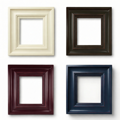
Selecting a frame colour is a process that involves weighing up several factors:
Colour consistency — the frame colour should work in harmony with the tones of the painting, creating a cohesive overall impression.
Neutral background or accent — consider whether you want the frame to serve as a quiet backdrop, or as a distinctive accent that draws the eye.
Intensity of colours — for paintings with rich, vibrant colours, frames in more muted tones tend to work best, as they don't compete with the artwork.
Subtlety and character — for soft, pastel works, a frame in a bolder colour can add definition and presence.
Frame Materials: Wood, Aluminium and Beyond
The choice of material is just as important as colour. Each material has its own unique properties that affect the final look and functionality of the frame:
Wood is a classic choice that brings warmth and a traditional character. It's versatile and pairs well with a wide range of interior styles.
Aluminium offers a modern aesthetic and is ideal for minimalist arrangements. It's lightweight yet highly durable, making it an excellent choice for contemporary artworks.
Other materials — plastics and composite materials can be used in more avant-garde projects, offering a broad range of colours and finishes.
How to Match Frame Colour and Material in Practice
When selecting a frame for a piece of art, it's worth bearing in mind that the frame gives the artwork its final character and influences how it is experienced in the space. In practice, this means the frame primarily shapes the visual perception of the piece — it doesn't alter its artistic value.
That's why, in many cases, it's worth choosing a frame that not only suits the composition but also reinforces the style of the interior.
Colour is the central consideration here. When selecting a frame colour, pay attention to the dominant tones of the artwork and its overall mood. In practice, frame colour should feel consistent with the composition and should not compete with the main subject.
For classical compositions, muted tones such as gold, bronze, or natural wood shades tend to work particularly well. These options complement paintings executed in a traditional style, where elegance and timelessness are the priority.
If you're looking for a light, contemporary feel, a pale or white frame can be a strong choice — it visually brightens the composition and helps the painting integrate naturally into minimalist interiors. A darker frame, on the other hand, can emphasise contrast and add greater depth to the work.
In terms of material, wooden frames bring naturalness and warmth — they are particularly effective as what might be called "warm frames," building a cosy, inviting quality in the interior. The term "warm frames" refers to the visual sensation created by colour and material, most commonly associated with natural wood and its various tones. Warm-toned frames are especially effective at enhancing the character of a painting and making the overall composition feel more harmonious.
An aluminium frame is a modern solution, frequently used in minimalist arrangements. Its clean form works well alongside contemporary painting and in interiors where visual lightness and economy of form are valued.
For canvas paintings, canvas frames are an excellent choice — they preserve the three-dimensional quality of the work and create a subtle separation between the painting and the wall. These frames are typically simple in form, which means they don't overwhelm the composition. Canvas frames are particularly well-suited to modern presentations, as they provide a clean, aesthetic finish to the edges of the canvas while maintaining its spatial character.
It's also worth remembering that a well-chosen decorative frame can completely transform the way an artwork is perceived. Depending on the style, you might opt for something more ornate or something more pared-back — but the most important thing is that the frame suits both the character of the painting and the space in which it will be displayed.